Jasmine Ladines
Webpage Subjects
Feedback of Website
Webpage Newspaper
DORA WANG'S SOCIAL STUDIES FEEDBACK
FIRST ARTICLE
-
Text is too close to the divider/borders
-
Navigation Bar should be at the top
-
Body text could’ve been distributed better to make the text more appealing to read (ex. bullet points)
-
Background colour and text has good contrast
SECOND ARTICLE
-
Some blank spaces around the text
-
Text can be distributed more evenly to lessen the blank space and create more balance.
-
unbalanced design (night side is a lot more blank compared to the left side)
-
The divider on the right bottom side isn’t fully closed
THIRD ARTICLE
-
Blank spaces around the headers and photo area
-
The border/divider isn’t evenly lined up
-
Too much text in one cell
-
Not a lot of visual hiarchy
-
A lot of blank space in the bottom middle
FOURTH ARTICLE
-
Body text is too crowded, can be broken up
-
Left bottom side the text isn’t in the divider
-
dividers aren’t lined up evenly
-
Blank space around the photos and key concepts header part
PROS
-
Organized layout ( page is divided into sections
-
Good use of headings
-
Relevant visuals
-
Informative context
-
Consistent theme
-
Balanced colour pallete
-
Good contrast between text and background color
CONS
Body text can be broken up more
Uneven balance certain sides take up more space than the other
-
Not a lot of visual hiarchy to make it more appealing
-
Navigation bar styling
-
Visual flow (highlighted sections or dividers could help
• Good extras: between text and background colour
• Colour is a bit dull since the colour pallet is only grey and blue
BROTHER'S ENGLISH FEEDBACK
1. Simple and clean layouts with supporting explanations from the headings on some pages
2. Very organized and easy to read texts
3. The pictures don't really reflect and support what the topics are being talked about therefore it would be better, and if the audience had a better visual to support the topic that's being mentioned beside it
4. Would like the "Key Concepts" page to be a consistent theme just like the other pages as far as the layout with pictures.
5. "Curriculum" page seemed a little incomplete in terms of how the paragraphs were laid out and displayed
6. The paragraph about each topic was well thought about + Clearly explained from one topic to the next.


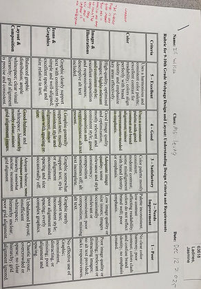
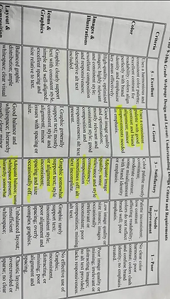
RUBRIC FEEDBACK
ENGLISH - DORA